People often overlook the importance and impact of colour choices in their homes. Some choose to follow the latest trends, while others opt for something more traditional. Others choose bolder colours and paint every room with a feature wall.
What does the meaning of these colours have on your mental and physical well-being? There are many books on colour psychology. We’ve put together a list of essential information before you start painting with a brush.
LIGHT YELLOW
Because it has a subtle undertone and is not too obvious, this is a popular choice for home interiors. When you think of yellow, happiness is the first thing that comes to your mind. Yellow is the colour associated with happiness. It also evokes warmth and cheer.
The sun emits ultraviolet rays that help release endorphins in our bodies, resulting in bursts of euphoria. The same can be said for light yellow, which can induce the same psychological feelings that actual sunlight does.
LIGHT GREEN
When you paint your walls pale green, you can create the feeling of a quiet forest or outstretched glade. This colour is great for creating calm and quiet homes. Bright furnishings such as art and cushions are a great way to add colour to the home.
If you prefer a calm and serene home environment, you can play with this colour by selecting wooden furniture, earth tones and landscape feature artwork to tie it all together.
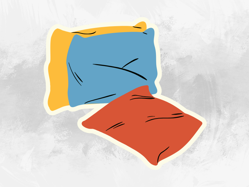
SKY BLUE
Blue is a great colour for bedrooms because it promotes calm and tranquillity, which is ideal for getting a good night’s sleep. Sky Blue, another calming colour is known for creating an atmosphere of safety and trust. It’s a great choice for bedrooms for children or babies.
Sky Blue is quite bright and should not be used throughout your house. However, a feature wall or accent colour placed throughout your room will highlight its positive properties.
DEEP RED
Deep red is a rich, robust colour. It exudes elegance and a well-cultivated taste that is reminiscent of good wine. This colour is often used in old English homes. It should be used sparingly, but it can make a beautiful feature wall in the dining area or lounge. This will give the room an old-world feel and create an expensive look with the right furniture.
Certain colours can also cause negative emotions so make sure you choose the right colour. Reds that are bright or intense can evoke anger and danger. This colour is best for large, well-lit rooms. Darker colours can make smaller rooms seem even smaller.
BLACK
Black is very in fashion right now, but it can be challenging to work with because it is a powerful shade that can communicate the positive emotions of elegance or sophistication but also can represent loss and oppression. Black is best used to bring out its best qualities. Therefore, everything you do with it should be bold, classical and expensive to highlight the best aspects of black.
Because black is pure and pristine, it works well with white. Black can also be used in earth tones, but bright accents can make it look too tacky.